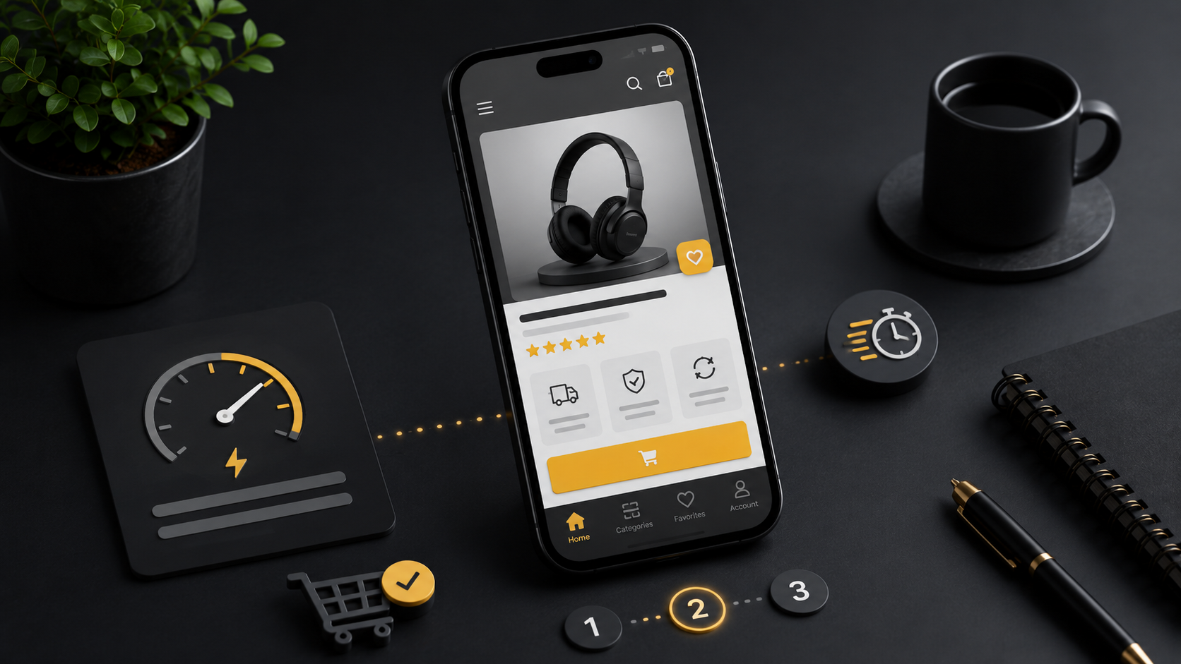
Plan for mobile from the start
Designing everything for a large screen and stacking it at the end often produces a long, heavy page. Mobile planning should start when the content is organized. Decide which information and actions a phone user needs most on each page.
A restaurant might prioritize its menu, address and contact details. An online store may prioritize search, product images, prices and the basket. Order the sections around those needs instead of automatically following the desktop order.
Make headings and copy easy to scan
People often browse on their phones while moving, using one hand or dividing their attention. Long paragraphs and tight spacing make information harder to absorb. Give each section a clear heading, a short explanation and a list when it helps.
Open the page on a phone and look at it for five seconds. Can you identify what it offers and the main thing you can do next?
Design controls for touch
Small links and closely spaced options lead to accidental taps. Calling, buying and booking controls need comfortable sizes and space around them. The button label should describe the outcome: “Book a consultation” is clearer than “Continue.” A fixed action button can help when it does not cover the content.
Keep forms focused
Entering information on a phone is more demanding than on a desktop. Request only what the current step needs. Use a suitable keyboard for telephone numbers and email addresses.
- Keep field labels visible.
- Explain errors in plain language near the affected field.
- Separate date and time selection when it makes booking easier.
- Show a waiting state and a clear result after submission.
Keep the visual experience practical
Large images, autoplay video, many fonts and extra scripts can delay the page. Serve images at appropriate sizes and load lower-page images when needed. Animation should explain relationships or provide feedback rather than make visitors wait for the content.
Use real devices as well as simulators
Browser simulators are useful, but they cannot show every issue. Test real phones, Safari and Chrome, mobile connections and landscape orientation. Opening the keyboard, the browser’s controls and larger system text can affect a layout. Floating contact tools should not cover essential information.
Measure whether people can complete the task
A good-looking mobile site still needs to help someone find a product, call, finish a form or buy. A short route, clear feedback and fewer errors often matter more than elaborate visual effects.
Let’s discuss your website
We plan responsive layouts around the tasks your customers need to complete and check the important journeys before handover.
Book a free consultation